2008 Music Listening Activity

Visualization generated by LastGraph
Standard Deviation of Release Year Segmented by Calendar Year
This graph shows the variety of the year of release for each year that I’ve been collecting music. The lower the number, the more consistent the year of release is for albums I acquired that year. In the 1990’s you see lower numbers because at the time I was mostly into 90’s rock.
Later, as I diversified my interests, the span of which I was collecting from increased, thus the jump.
The green line is the standard deviation for my library as a whole.

updated 2008.07.30
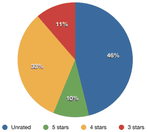
iTunes Star Ratings Breakdown
updated 2007.11.19
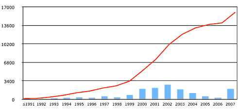
Library Growth
The graph below shows the growth of my iTunes library over time and the rate at which it grew. I back-date all my music to the time that I actually acquired it, not the time I happened to add it into iTunes. If I got a CD for my birthday in 1997, I make sure iTunes thinks I added it on my birthday in 1997.
iTunes was originally released in 2001. I can be reasonably sure that songs added after then are accurately dated. And I do have a number of personal resources, such as an old Audiofile database, to help me pinpoint when I acquired much of the music before then.
However, the potential for discrepancies exists. Though I’ve tried to be diligent in my dating, there is the possibility that the height for 2001-2003 are artificially inflated at the expense of parts of the 90s, as those where the years when the bulk of my CD collection was converted to a digital collection.
The blue columns show the number of songs added in that year, while the red line indicates the total size of my library, in songs, as time has progressed.
updated 2007.10.15
One thought on “Graphs & Charts”