Have a graph.
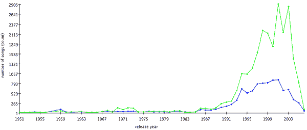
This chart excludes film and classical music, focusing on popular releases. The blue line shows the total number of songs from each year of release in my library. The green line shows the cumulative playcount for records released that year. Make of it what you will, but apparently 2001 and 2003 were very good years for music.