The Beatles + Nine Inch Nails = Come Closer

The Beatles vs. Nine Inch nails Come Closer Together

I was tempted to let this pass without comment, but it’s just so intriguing. It’s a mash up of the Beatles Come Together and Nine Inch Nails’ Closer by DJ Zebra. The ending is a bit flubbed, but overall this is a very good combination.

It’s particularly noteworthy since both sources are rock songs and it’s rare to see good rock mash ups. Because of the way most rock songs are written and performed, its harder to effectively combine two of them than it is to lay rap lyrics over a riff or rock vocals over a hip hop beat.

Playgrounds: Fun and interesting applications of Last.fm’s technology

The vast array of listening information available at Last.fm probably had a great deal to do with CBS’s decision to purchase the company. Though I’m wary of the deal, I’ve not lost all hope for the site. The Audioscrobbler technology behind it is some pretty fascinating stuff and the data it collects is open and available be analyzed, interpreted, shared and displayed in a lot of diverse applications.

Hopefully, now that CBS’s hand is in the cookie jar, this aspect of the service won’t change. As long as the data is accessible, here’s a number of cool things that can be harvested from Last.fm.

LastGraph

last.fm waveform 2007

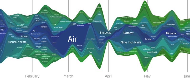
My waveform for 2007, through the beginning of June.

Lee Byron’s work on Last.fm data visualization made a fairly large splash on the net recently. The multi-colored waveforms showed undulating music tastes as artists’ popularity expands and contracts over time. It’s fascinating stuff.

And of course, after a moment of exclaiming "cool!" and "pretty!" the question on everyone’s mind was "How do I get one for myself?" Since Byron’s page was more of a demonstration and proof-of-concept, there was no way for someone to enter their username and get a graph of their own listening habits, leaving many visitors disgruntled.

Enter LastGraph, which does what all those disgruntled users were requesting, for whatever username you want. Results are offered in PDF and SVG formats, which are vector based, so you can zoom very close to see small-scale changes in data. The only thing that’s missing is the ability to track an individual artist within the ebb and flow of your listening. Specifically, I’d like to hover over a line and see that artist’s trends highlighted. That’s not going to happen with a PDF though. Oh well.

The site is running kinda bare-bones right now and there is a queue system in place. You may have to wait several hours before your PDF is ready to download. So be patient. It’s worth it. The site’s performance has much improved since it launched.

Also note: the PDFs produced by the site do not render in Mac OS X’s Preview app, so be sure to view them in Acrobat.

Musicmapper’s Last.fm in Time


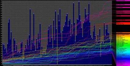
This chart shows my listening habits during the past 121 weeks (roughly the beginning of March 2005). Click to see larger.

Musicmapper’s Last.fm in Time generates a single graphic that displays a variety of data. The bar graphs in the background represents the total of each weeks play counts. Your top 50 artists are displayed, in rank order, on the right. The line graphs show how each of the top 50 have grown over time.

This can be useful for determining trends in your tastes and habits. In my case, before the 52 week mark, I see a lot flat-lined activity, especially among my top ten, that suddenly takes off. Also, I notice that Susuma Yakota, who I had never heard of before January this year, is in my top 50 and that he got there rather quickly. There is a very steep curve for him starting 23 weeks ago.

Tuneglue relationship explorer


Click for full size.

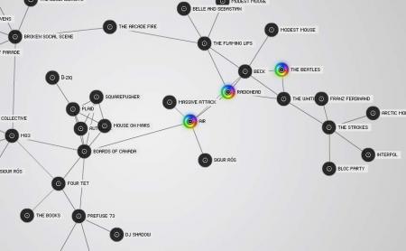
Tuneglue creates a web of related bands and artists. Start with one artist or band, expand the results to find similar artists or bands, then do the same to those. With four or five clicks, you’ll have a large interconnected web of new bands to explore based on similarities and relationships to your tastes. It’s a neat visual metaphor of musical interest and a good jumping off point for new music recommendations. The lack of sound samples limits its usefulness as an exploratiom tool, though the map is still fun to play with.

One killer app of the site, however, is missing. I talk of course, about a "six degrees" linker. It would be very cool to input two artists and see how many jumps are necessary to connect to two. For example, it takes four jumps to connect Mogwai to the Strokes (Mogwai » Radiohead » The Beatles » The White Stripes » The Strokes, according to Tuneglue). I figured that out on my own, but it would be nice of the site to do it for me.

Last.fm tools by Anthony Liekens

cloud of recommendations

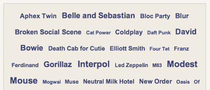
This site features a number of Last.fm related tools. My favorite is the artist recommendation cloud, which generates a number of suggestions for musical exploration based on your top artists. Higher recommendations appear at a larger type size. Recommendations can be based on stats from your overall list, the past 12, 6 or 3 months or the past week.

Also be sure to check out your eclectic rating. I scored an 80 out of 100.

How compatible are your tastes with a radio station?

sekrit

Last.fm user profile bbc6music is, you guessed it, created by the songs BBC Radio 6 (6music) plays on air. Though not every song that the station broadcast gets uploaded to Last.fm, the user profile still manages to add about 100 play counts per day. As of August 2011, the station has an accumulated track count of nearly 380,000. The most played artist is David Bowie.

Mainstream-o-Meter

mainstreamnes

Finally, there’s the Mainstream-o-Meter, which compares your top stats with the overall most played artists site-wide. Each of your most-listened-to artists are given a weighted score which is then used to calculate your overall "mainstreamness."

::

Last.fm is certainly a vast treasure trove of information, so hop to it and get exploring.

In search of a definitive album rating formula

When it comes to my iTunes library, I’m a regular statistics nut. Sure, my library exists primarily for my own enjoyment, but it contains so much organically-compiled data about my habits and tastes that I can’t help but want to take a look at it and find out what the data says about my interests.

But for a while now, I’ve struggled to quantify, tabulate and analyze the overall sense of my library. Which of my albums albums are truly the greatest? Which artists, when the sum of their parts are combined, are really my favorites? And by how much? I want numbers.

None of the iTunes stats options available at the moment give me the type of results that I want. The Album Ranking AppleScript provides a simple average that skews toward albums with fewer tracks. SuperAnalyzer provides a top 10 list that is skewed toward albums with more tracks.

Most iTunes stats tools simply provide averages or totals of play counts and/or star ratings. Averages, while somewhat useful, can be misleading. An album could have a handful of awesome songs and a bunch of filler and still rank as well as and album that’s consistently good, but without much breakout material.

And that can be frustrating to me, because, in terms of album or artist worth, I tend to value the ones with consistent performance.

Take, for example, my recent run-down of Air’s discography, specifically the albums 10000 Hz Legend and The Virgin Suicides. After many years of listening, my artistic impression is that Virgin Suicides is ever so slightly the better of the two. The songs on Legend vary from excellent to clunkers. Suicides is overall pretty good, with only one exceptional track. However, averaging my ratings shows that Suicides is a 3.85 while Legend rates as an even 4.

So, to reward albums that don’t veer wildly around the quality wheel, I’ve developed my own album rating formula that takes into account the consistency of all the star ratings on a given album.

The Formula

album rating = (mean of all songs + median of all songs) - standard deviation of the set

The mean sums up the whole of the album. The median shows the state of the album at its core. The standard deviation indicates the variety of the individual ratings. The result is a number on a scale of 1 to 10. (Alternately, divide that number by 2 to return the result to a 5-star scale).

Let’s take a look at the formula in action. Suppose we have two albums with twelve songs each. The first is generally excellent, but varies in quality. The second is good stuff throughout.

Ex. 1 Ex. 2
5 4
4 4
5 4
2 4
4 4
5 4
5 4
2 4
5 4
3 4
5 4
3 4
Mean 4 4
Median 4.5 4
total 8.5 8
STDEV 1.21 0
Score 7.29 8

This table shows the individual star ratings for the two theoretical albums, as well as all the statistical data, as calculated by Excel. As you can see, both albums average score is the same (4) and Ex 1 even has a higher median than Ex 2. But, because the quality of Ex 1’s songs vary a great deal, its standard deviation is substantial, so much so that its album rating becomes 7.29 (or 3.645 on a 5-star scale) when my formula is applied. Ex 2’s score suffers no penalty and its score remains 8 (4). In this case, the standard deviation awarded Ex 2 a bonus for being of uniform quality.

Let’s take a real world example, the two Air albums I mentioned above.

10 kHz Legend Virgin Suicides
4 4
5 4
4 4
5 3
5 3
4 4
3 5
4 4
3 4
3 4
4 4
4
3
Mean 4 3.84
Median 4 4
 
total 8 7.84
 
STDEV 0.77 0.55
 
Score 7.23 7.29

When the formula is applied to my ratings for each, the scores for 10000 Hz Legend and The Virgin Suicides become 7.23 (3.62) and 7.29 (3.65), respectively. So factoring in the standard deviation results in a score that more closely reflect my thoughts of those two albums.

So what does this mean? I’m not sure exactly. In practice, I could whip up some listy goodness and see which albums are truly my favorites. A comprehensive analysis would be cool. I’d love to see the distribution of my album ratings. However, that would require more programming skills than I have. Though that could be a good project to help me learn.

Out of curiosity though, I have picked 10 albums, just to see how they rate. One provision, of course, is that every song on an album must have a rating before the album score can be calculated. These ratings are on a 5-star scale.

AVG My Score
Radiohead – OK Computer 4.5 4.41
Air [french band] – Moon Safari 4.5 4.39
Nirvana – Nevermind 4.5 4.24
Mouse on Mars – Radical Connector 4.33 4.23
Ratatat – Ratatat 4.45 3.97
Nine Inch Nails – With Teeth 4.31 3.77
The Strokes – Is this it? 4.09 3.7
LCD Soundsystem – LCD Soundsystem 4 3.68
Basement Jaxx  –  Remedy 3.73 3.51
Prefuse 73 – One Word Extinguisher 3.82 3.47
Weezer – Make Believe 3.58 3.21

This is by no means a top 10 list, but it is interesting to see where things ended up. It’s also interesting to see how minor fluctuations in star ratings can change the final score. For instance, if that Ratatat album had one more 5 star song in place of a 4 star song, its median number would become 5 and its album score would jump to 4.51. Lower a 5 star to a 4 star and the score only drops slightly to 3.93. I don’t know if this is a flaw in the formula or a reward for albums that have a lot of good songs.

Problems and issues

Small data sets. These are troublesome in all statistical circumstances and this formula is no different. Albums with only one song will, by definition, not have a mean, median or standard deviation, and that kills the formula with a divide-by-zero error. Also, because the formula uses the average rating as a component, albums with a low number of songs will tend to skew one way or the other.

In my library, Boards of Canada’s EP In A Beautiful Place Out In The Country has four fantastic songs and ranks at 4.63, higher than anything on that list above. As a release, I’d say that’s accurate, but I’m sure it doesn’t surpass OK Computer. I would be interested to see a chart of how the album score changes as the number of tracks on an album increases.

Additionally, I haven’t figured out a way to rank partial albums, i.e. albums where I either don’t own all the songs or albums where I’ve deleted songs I didn’t like. For now, I’m just excluding them altogether.

Still, I’m fairly pleased with the results I’ve been getting as I run various albums through the formula. It’s working for me and my own song rating system, but I’m curious to see how it works with someone else’s.

Fortunately, Webomatica has posted his song-by-song ratings for The Beatles’ Sgt. Pepper’s Lonely Hearts Club Band. Using his numbers, the average for the album is 4.38, while my formula renders a 4.28. I’d say that’s a consistently good album.

::

Here’s a Microsoft Excel file you can download. Plug in your star ratings to find the album score. AlbumScore.zip
Pearl Jam: I Got a Feeling [Beatles cover]

Back before all this digital music and internet mumbo jumbo, finding a live recording of a band’s performance was a tricky proposition. There were basically two ways to go about it. One, if you someone who was in a bootlegging circle, you could ask to trade a copy of their recording for a copy of one you had. These were the days before CD burners, so any copy you received was on lesser-quality cassette tape. Or two, you could stumble upon one in the racks at used music stores, finding a quasi-legal, imported recording.

Sometime in 1993, I happened upon a CD, imported from Italy, called I Got a Feeling, via that second method. It’s a high-quality recording of Pearl Jam, live at the legendary (and recently closed) CBGBs in New York City, November 8, 1991 (about 2 months after the release of Ten).

It was a surprise gig that ran about 40 minutes and was attended mostly by fan club members. That explains why the audience on the recording seems to know all the words, despite the fact that Ten wouldn’t enter the Billboard 200 (at #155) for another 2 months.

For comparisons sake, Nirvana’s Nevermind was already at #17 on the chart the week this was recorded.

Still, the show itself is an illustrative overview of that early period of the band’s history. The best part however is the final song of the set: a fantastic cover of The Beatles’ I’ve Got A Feeling with some nice ad-libbing from Eddie.

Download: I Got A Feeling (iTunes m4a file)

Enjoy.