Cumulative lifetime play counts

A rambling, self-indulgent, inconsequential post about habits, statistics, speculations, accumulation and missing data.

::

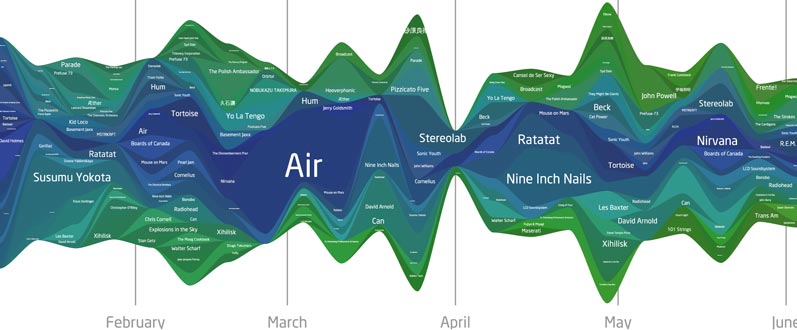
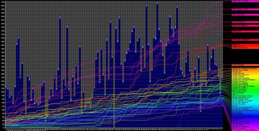
I can’t help but be disappointed that I can’t see lifetime stats for my music listening habits. In these days of play count-tracking programs like iTunes and websites like Last.fm, it’s easy to get caught up in the musical trends of your life. It’s especially interesting when you look at the numbers and discover that you perhaps don’t like a certain style of music as much as you thought you did or you find that you listen to a particular band much more than you would have guessed.

The problem is that your revelations are only going to be as good as the data you’ve collected. I’ve been a “serious music listener” for about 16 years, yet Last.fm has only been tracking my habits for three and my iTunes library only goes back six. I have ten years worth of listening that I will never have any way to quantify simply because the data was never collected.

Missing data, of course, skews results and in this case, snapshots of my habits are skewed in favor of recent years, especially when looking a cumulative lifetime stats. Using data from my library as it stands today, I put together a graph of my most popular years in music. I’ve been for the most part, a contemporary music listener, so the vast majority of my library contains music released from 1993-2008, adding new releases each year.

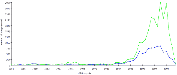
I calculated the total number of play counts received by all songs in my library that were released in a given year. Here’s the result:

itunes play counts by year

This graph shows the distribution of all my play counts generated since July of 2002 (when iTunes began recording them). We see a peak in 2001 and a general downward slope since.

My explanation for the shape of the graph is that, as years come and go and a music library grows, newer music receives more attention than older music. Familiar tunes give way to new acquisitions and explorations. However, those old tunes never entirely go away; they continue to co-exist with the new ones. As the years pile up, each one’s presence is diluted among the rest and it becomes and increasingly uphill struggle to for the songs of a new year to reach parity with those of the past.

So in this particular graph, I attribute the 2001 peak to the simple coincidence that the songs from 2001-early 2003 were in high rotation at the time that iTunes started tracking play stats. As a result, the initial rate of change for those songs was quite high. And even though the rate at which those songs get played has decreased (exponentially) over time, the songs from other years still have to compete with them for attention, so we find a general trend decreasing cumulative play counts.

average play count by year
Average Play Count by Year

Further evidence of this idea can be seen in the average play count for the songs of each year. There’s a bump in the 2003-2004 area, reflecting the idea that older songs tend to accumulate more play counts over time.

I can’t help but wonder what that play count graph would look like if iTunes had been released in the early 1990s? How much cumulative lifetime play would we see throughout the years?

Of course, there’s no way to figure that out. That information is trapped in the fog of memory, stored in transitory listenings of cassette and compact disc. But while that individual play counts may be lost forever, it might not be impossible to make a decent educated cumulative guess.

I’ll start with the premise that from the years 1993-2001, I averaged a mere 10 songs per day between school bus rides, studying, hanging out, commuting and partying from early high school, through college and my entry into the workforce. That’s probably a conservative estimate, considering the general lengths of my bus rides and commutes. Heck, I’ve managed to generate nearly as many plays in the past 6 months, and I’ve lately been slacking on my music listening in favor of podcasts and audiobooks. But 10 is a good number, so I’ll stick with it.

So, at 10 songs per day, that’s 3650 plays per year. Consider the state of my collection in those early years. Throughout high school and into college, I managed to add records to my library at an average rate of one per week. If iTunes had been around at the time, play counts by now would be heavily concentrated in those early additions, with the highest concentrations being in the earliest records I bought.

By the end of the first year, my estimated 3650 plays would be spread among a mere 500ish songs, an average of 7.3 per songs. By the end of the next year, another 3650 plays would be spread out among about 1000 songs, 3.6 per song. Except that I expect that drop off in older songs to be exponential, not linear.

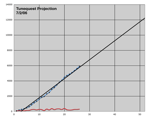
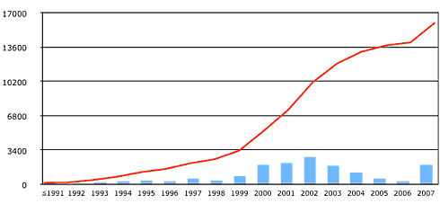
After some more conjecture and guess work, I extrapolated the accumulation of play counts over the years. After some number-crunching, I had a graph that looks like this:

cumulative play counts by year adjusted

The blue line is the same as above, showing the cumulative distribution of play counts by year of release in my iTunes library. The green line represents what the graph would look like if my estimated historical plays were added to the existing totals.

What does this totally unscientific, made up graph tell me? Basically what I already suspected: that I’d have to stop listening to my older tunes altogether and for a long time if I ever wanted current tunes to “catch up.” Of course, in the time it would take to do that, future tunes would be at a deficit. So really, while it’s a somewhat nice visualization, in reality it will have no bearing on my future plans.

Standard Deviation of the Years in my iTunes Library

I spent part of the past weekend doing some basic statistical analysis of my iTunes Library. I’ve been collecting music for 16ish years now, so I decided to see what kind of historical trends I could find.

One task I assigned myself was to look at the variety of the time span of the releases in my collection. Now I don’t have to do any fancy calculations to tell you that the vast majority of the songs in my library date to the same 16 year period that I’ve been collecting for. Indeed, if you line up all the songs in my library in chronological order by release date, the Median year is 1998. That is to say that half the music in my library was released before or during 1998 and the other half was released during or after that year.

The next step I took was to look at the variety of the release years for each calendar year that I’ve been collecting. I did that by segmenting my library by each year since 1993 using iTunes’ Date Added field, then calculating the standard deviation of the Year field for every song on that list. The lower the result, the more “consistent” that year’s additions were. The higher the number, the greater the eclecticism in that year’s acquisitions.

The results are plotted in this graph:

The green line is the standard deviation for my library as a whole.

In the 90s, I was pretty much an “alternative rock” junkie, so the span of years is pretty narrow overall. But see the bump from 2000-2002? That was late college and my hipster days, when I really had all the time in the world to haunt record shops, variety stores and Usenet groups in attempts to explore the most obscure nonsense. I mean, Morton Subotnik and film scores to Godzilla movies. That kind of nonsense.

It’s cool though, I also discovered Can and Neu! during that same time.

Playgrounds: Fun and interesting applications of Last.fm’s technology

The vast array of listening information available at Last.fm probably had a great deal to do with CBS’s decision to purchase the company. Though I’m wary of the deal, I’ve not lost all hope for the site. The Audioscrobbler technology behind it is some pretty fascinating stuff and the data it collects is open and available be analyzed, interpreted, shared and displayed in a lot of diverse applications.

Hopefully, now that CBS’s hand is in the cookie jar, this aspect of the service won’t change. As long as the data is accessible, here’s a number of cool things that can be harvested from Last.fm.

LastGraph

last.fm waveform 2007

My waveform for 2007, through the beginning of June.

Lee Byron’s work on Last.fm data visualization made a fairly large splash on the net recently. The multi-colored waveforms showed undulating music tastes as artists’ popularity expands and contracts over time. It’s fascinating stuff.

And of course, after a moment of exclaiming "cool!" and "pretty!" the question on everyone’s mind was "How do I get one for myself?" Since Byron’s page was more of a demonstration and proof-of-concept, there was no way for someone to enter their username and get a graph of their own listening habits, leaving many visitors disgruntled.

Enter LastGraph, which does what all those disgruntled users were requesting, for whatever username you want. Results are offered in PDF and SVG formats, which are vector based, so you can zoom very close to see small-scale changes in data. The only thing that’s missing is the ability to track an individual artist within the ebb and flow of your listening. Specifically, I’d like to hover over a line and see that artist’s trends highlighted. That’s not going to happen with a PDF though. Oh well.

The site is running kinda bare-bones right now and there is a queue system in place. You may have to wait several hours before your PDF is ready to download. So be patient. It’s worth it. The site’s performance has much improved since it launched.

Also note: the PDFs produced by the site do not render in Mac OS X’s Preview app, so be sure to view them in Acrobat.

Musicmapper’s Last.fm in Time


This chart shows my listening habits during the past 121 weeks (roughly the beginning of March 2005). Click to see larger.

Musicmapper’s Last.fm in Time generates a single graphic that displays a variety of data. The bar graphs in the background represents the total of each weeks play counts. Your top 50 artists are displayed, in rank order, on the right. The line graphs show how each of the top 50 have grown over time.

This can be useful for determining trends in your tastes and habits. In my case, before the 52 week mark, I see a lot flat-lined activity, especially among my top ten, that suddenly takes off. Also, I notice that Susuma Yakota, who I had never heard of before January this year, is in my top 50 and that he got there rather quickly. There is a very steep curve for him starting 23 weeks ago.

Tuneglue relationship explorer


Click for full size.

Tuneglue creates a web of related bands and artists. Start with one artist or band, expand the results to find similar artists or bands, then do the same to those. With four or five clicks, you’ll have a large interconnected web of new bands to explore based on similarities and relationships to your tastes. It’s a neat visual metaphor of musical interest and a good jumping off point for new music recommendations. The lack of sound samples limits its usefulness as an exploratiom tool, though the map is still fun to play with.

One killer app of the site, however, is missing. I talk of course, about a "six degrees" linker. It would be very cool to input two artists and see how many jumps are necessary to connect to two. For example, it takes four jumps to connect Mogwai to the Strokes (Mogwai » Radiohead » The Beatles » The White Stripes » The Strokes, according to Tuneglue). I figured that out on my own, but it would be nice of the site to do it for me.

Last.fm tools by Anthony Liekens

cloud of recommendations

This site features a number of Last.fm related tools. My favorite is the artist recommendation cloud, which generates a number of suggestions for musical exploration based on your top artists. Higher recommendations appear at a larger type size. Recommendations can be based on stats from your overall list, the past 12, 6 or 3 months or the past week.

Also be sure to check out your eclectic rating. I scored an 80 out of 100.

How compatible are your tastes with a radio station?

sekrit

Last.fm user profile bbc6music is, you guessed it, created by the songs BBC Radio 6 (6music) plays on air. Though not every song that the station broadcast gets uploaded to Last.fm, the user profile still manages to add about 100 play counts per day. As of August 2011, the station has an accumulated track count of nearly 380,000. The most played artist is David Bowie.

Mainstream-o-Meter

mainstreamnes

Finally, there’s the Mainstream-o-Meter, which compares your top stats with the overall most played artists site-wide. Each of your most-listened-to artists are given a weighted score which is then used to calculate your overall "mainstreamness."

::

Last.fm is certainly a vast treasure trove of information, so hop to it and get exploring.

Finding Statistics About Your iTunes Library

iTunes logo with graph

Anyone who has been reading the tunequest for a while knows that statistics, numbers, figures and graphs have played a large part in its progress. In fact, it was the discovery that 10% of my songs were responsible for 49% of my total play counts that prompted me to set out on this endeavor in the first place.

To this day, I’m still surprised by the lack of sophisticated options available for gathering and analyzing iTunes’ stored data. That XML file has been a statistical treasure trove since the day it started recording star ratings and play counts. You’d think that in the four years since, there would be a more mature market of programs to choose from.

However, 2006 has actually seen some positive developments in that regard. While there is still no killer app for iTunes stats, there are a number of solutions for parsing your XML file and learning more about your music, and yourself.

Continue reading

Popularity Graph

Have a graph.

years of release

This chart excludes film and classical music, focusing on popular releases. The blue line shows the total number of songs from each year of release in my library. The green line shows the cumulative playcount for records released that year. Make of it what you will, but apparently 2001 and 2003 were very good years for music.

Graphs & Charts

2008 Music Listening Activity

2008 music activity graph generated by LastGraph

Visualization generated by LastGraph

Standard Deviation of Release Year Segmented by Calendar Year

This graph shows the variety of the year of release for each year that I’ve been collecting music. The lower the number, the more consistent the year of release is for albums I acquired that year. In the 1990’s you see lower numbers because at the time I was mostly into 90’s rock.

Later, as I diversified my interests, the span of which I was collecting from increased, thus the jump.

The green line is the standard deviation for my library as a whole.


updated 2008.07.30

iTunes Star Ratings Breakdown

ratingquest 071119
updated 2007.11.19

Library Growth

The graph below shows the growth of my iTunes library over time and the rate at which it grew. I back-date all my music to the time that I actually acquired it, not the time I happened to add it into iTunes. If I got a CD for my birthday in 1997, I make sure iTunes thinks I added it on my birthday in 1997.

iTunes was originally released in 2001. I can be reasonably sure that songs added after then are accurately dated. And I do have a number of personal resources, such as an old Audiofile database, to help me pinpoint when I acquired much of the music before then.

However, the potential for discrepancies exists. Though I’ve tried to be diligent in my dating, there is the possibility that the height for 2001-2003 are artificially inflated at the expense of parts of the 90s, as those where the years when the bulk of my CD collection was converted to a digital collection.

The blue columns show the number of songs added in that year, while the red line indicates the total size of my library, in songs, as time has progressed.

itunes library growth
updated 2007.10.15